How it's built
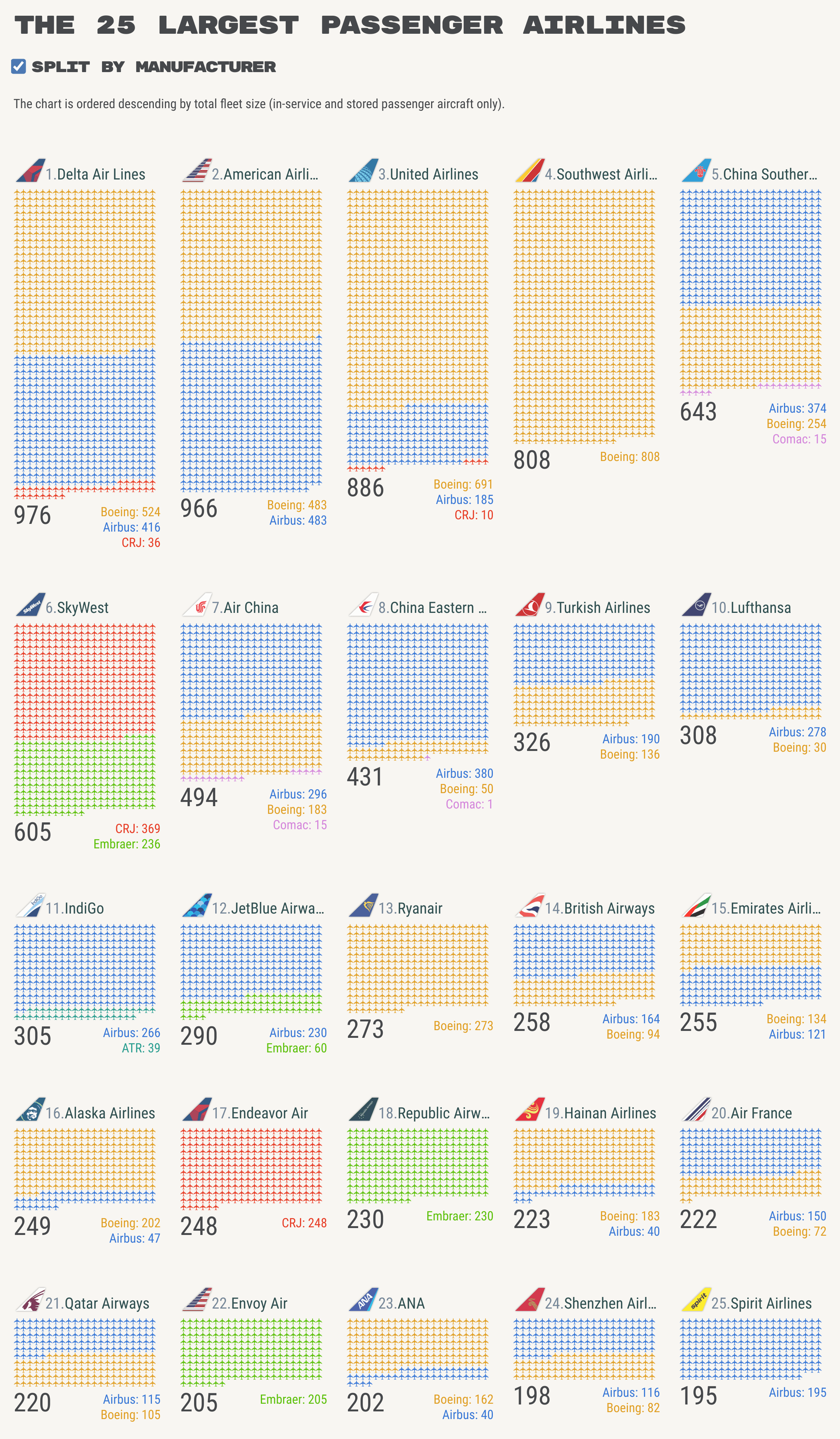
The isotype charts
There's nothing clever about the construction of the isotypes. Each chart is just a single <div> that contains between 1 and 3 <span> elements (one for each manufacturer). Each <span> then contains a series of aircraft glyphs e.g. 🛧🛧🛧🛧🛧.
The aircraft glyph
Each tiny aircraft image is the Up-Pointing Airplane Unicode glyph (🛧), and there are 10,016 tiny aircraft in the chart! My first attempt at this chart used inline SVGs for the aircraft, it worked, but it wasn't very performant. It then hit me that I could simply use an aircraft Unicode glyph i.e. a font, and this solution worked on my desktop, but not on Android, where the aircraft glyph was replaced with squares.
It turned out my default font did not support the aircraft glyph, so I had to find one that did. I eventually settled on Noto Sans Symbols 2. My only issue with this font was the size, i.e. it's >300 KB (it contained a lot of symbols). I then learnt about Font Forge, and I used this to remove all glyphs except for the aircraft, essentially creating a new single-glyph font file (3 KB, yeah!).
Populating the isotypes
As mentioned above, 10,016 aircraft glyphs are used in the chart, and although I could have entered them into the HTML manually, I actually updated the dataset quite a few times while making the chart, and updating the number of aircraft for each airline (and manufacturer) would have been laborious. In order to make things easier, I decided to let JavaScript (and my friend, Mendhak, help me out).
The JavaScript function is a simple loop that adds a string of aircraft glyphs into a <span> element based on a number I enter i.e. the number of aircraft from each manufacturer for each airline.
The JavaScript function:
function drawAircraft(numAircraft) {
  for (var i = 1; i <= numAircraft; i++) {
    document.write('🛧');
  }
}
The HTML source:
<span class="airbus aircraft grey-fill">
  <script>drawAircraft(40);</script>
</span>
The HTML output (as viewed in the browser's Developer Console):
<span class="airbus aircraft grey-fill">
  <script>drawAircraft(40);</script>
  🛧🛧🛧🛧🛧🛧🛧🛧🛧🛧🛧🛧🛧🛧🛧🛧🛧🛧🛧🛧🛧🛧🛧🛧🛧🛧🛧🛧🛧🛧🛧🛧🛧🛧🛧🛧🛧🛧🛧🛧
</span>
I could have used the function above to create the isotype charts, then viewed the HTML output, copied the resulting aircraft spans from the HTML output and into the source, and then removed the JavaScript (essentially pre-computing them all). And if this was the only use of JavaScript in the page then that's what I would have done, but I had to resort JavaScript (and my friend Mendhak, again) to build the 'Split by manufacturer' option, so I decided to leave this JavaScript in place.
Enabling the “Split by manufacturer” option
I placed a "grey-fill" style in the HTML head (which sets the aircraft font colour to grey) and applied it to all the aircraft spans. When the 'Split by manufacturer' option is ticked, this style is removed, and the manufacturer colours (defined in the CSS) are then visible.
The airline tailfins
Each airline tailfin is an SVG. Most were created from scratch in Figma (some were modified from existing SVGs kindly sent to me by another nerd friend i.e. Paul.
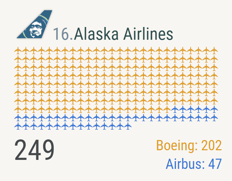
There are no bitmap/raster images used in the chart (even the aircraft font is a vector at its core). If you use your browser's zoom feature, you can zoom in on the chart and you'll notice no loss in image quality (you'll also notice that each little aircraft is a wide-body four-engine jet). A screenshot of the zoomed in isotype chart for Alaska Airlines is shown below.
What I learnt
How to remove unwanted glyphs from a font file
This is going to come in handy. The largest resources loaded for the majority of my pages are the font files, and I've always wanted to reduce the size of the files by removing glyphs I know I'm never going to use. I didn't know of an easy way to do this until I came across this guide (and then downloaded the free and open source software 'Font Forge').
Line breaks in HTML do matter (but only sometimes)
I was under the misguided assumption that line breaks in HTML had no effect on what was rendered in the browser. For the isotype charts where an airline had aircraft from more than a single manufacturer, this required multiple <span> elements, one for each manufacturer. In my code these were each separated by a line break. Unknown to me this placed a small space between the <span> elements' rendered output, which meant that the aircraft glyphs in the isotype charts were not forming a regular grid. The solution was to simply place the <span> elements on a single line. You can see this on this JSFiddle.
You can define your inline SVG's path in your CSS… but not in Safari!
In the first version of this infographic, I used an inline SVG for the aircraft glyph, but that meant repeating the SVG 10,016 times in the HTML. I was therefore very pleased to discover that the SVG's path could be pulled out of the inline SVG and instead defined in the CSS. I was then very unpleased to discover that this was not supported in Safari!


